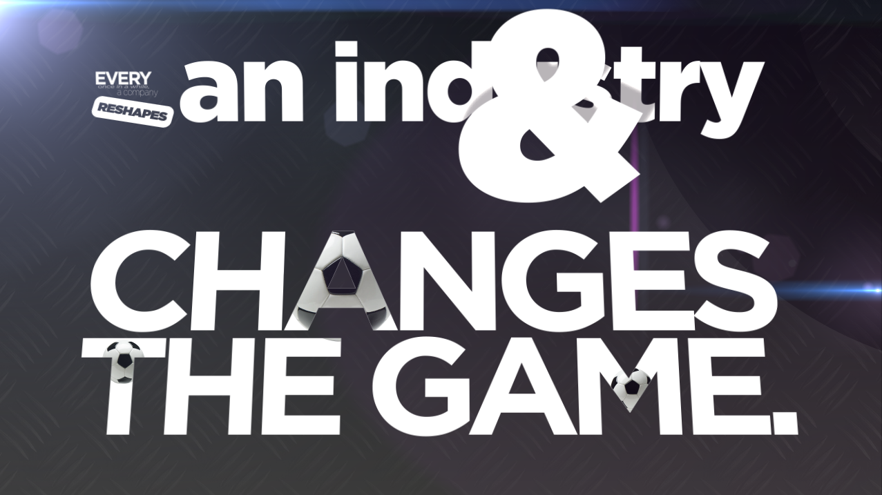
For today’s tips, we turn to SolidLine Motion Graphics Artist Justin Younger
DO NOT USE THE FOLLOWING TEXT!
Comic Sans, Papyrus, or anything Ornamental (the kind of font that is overly designed). Do you want your work to look terrible and unreadable? Of course not.
KERN!
Thanks to Wikipedia, we learn that kerning is “the process of adjusting the spacing between characters in a proportional font, usually to achieve a visually pleasing result.” And don’t just crank it down so your letters smash together. “Kem” is the popular internet joke, because the r & n touching look like an m. That looks even worse. Go in-between each letter and work it out. You don’t have to do that for huge paragraphs of text, but if the text is part of a design its important.
Don't Always Use Helvetica
Don’t worry about using this font a lot (some people get up in arms about it, and those people are sad and lonely). It is a fantastic versatile font that has been around for a long time that everyone can read with ease. BUT, if you use it too much it looks like a crutch. Mix it up.
Illustrator, Not Photoshop
Design your font in Illustrator, not Photoshop. There are huge advantages to doing so, Illustrator was built to do just that. Photoshop was built to replace heads on your friends.
Check Your Leading
Leading is the space in between the lines of a paragraph. Don’t smash them together.
Those are just FIVE ways to make sure your text looks perfect. To find out how Justin and the SolidLine Media Motion Graphics team can put together an amazing production for you, CONTACT US HERE.
Tell Us About Your Project
Regardless of the type of video your organization needs from our team, there’s a
perfect mix of live video and motion graphics that will meet your needs